Case study · Platform systems · Multi-surface

One definition,
every surface

A brand lived in a document kept outside the product, so a logo change became a scavenger hunt. I replaced it with one definition the system reads from, across four surfaces and sixteen dependent teams.
CompanyKeap, acquired by Thryv
RoleLead designer · research & IA owner
Scope4 surfaces · 16 dependent teams
Timeframe2023 to 2026
FocusSystems · Multi-surface · Vendor constraints
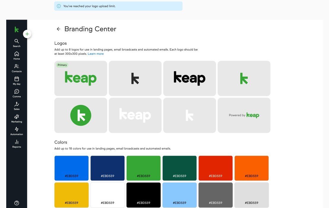
The Branding Center: a grid of eight logo variants with the first badged Primary, a palette of brand colours with hex values, and a banner reading You have reached your logo upload limit

Product screens, captured from demo accounts.

01 · Why this work

A logo change should not be a scavenger hunt

Partners build campaigns for their clients: fifteen or more emails and landing pages in a single campaign. When a client sent a new logo or changed a button colour, the partner opened every asset in every automation and redid it by hand.

No way to apply a brand

Branding could not be applied to emails and landing pages effectively, so outdated assets and misused logos went out the door.

Hours to weeks, per client

Partners described the workaround as taking anywhere from a few hours to a few weeks for a single client app.

Shared content arrived unbranded

Campaigns distributed into a client’s own app carried nothing of that client’s brand with them.
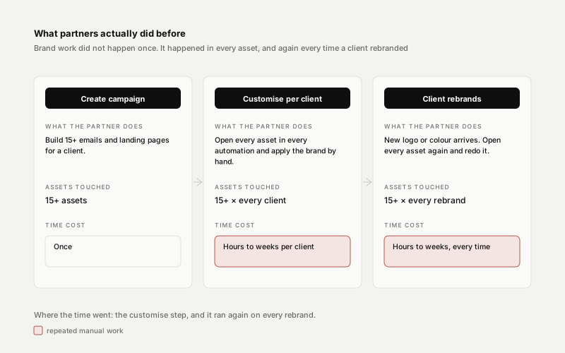
Three-stage partner journey with the manual rebranding steps highlighted
The partner workflow before the Branding Center. Brand work ran once per asset and again on every rebrand: the highlighted cells are where hours became weeks.
02 · My role

Designer on the system, not just the screen

I owned the research and the information architecture, and carried the design across four teams and a builder we do not own.

01

Owned the research track

Thirteen participants in 45-minute one-to-one sessions: partners, onboarding coaches and end users. Then a five-platform competitor audit, then a concept test before anything got built.

02

Decided the system rules

Where brand assets live, what a “primary” logo means, and how one definition reaches every surface that renders it.

03

Carried it across sixteen dependent teams

I made the pitch that connected the Branding Center into a new landing page builder. The pitch listed sixteen dependent teams; my job was making one brand definition survive all of them without owning any of them.

04

Ran the cross-team workshop

Current state, future vision and two ideation blocks with the PM, tech leads, engineers and the content-sharing team sketching against the same board.
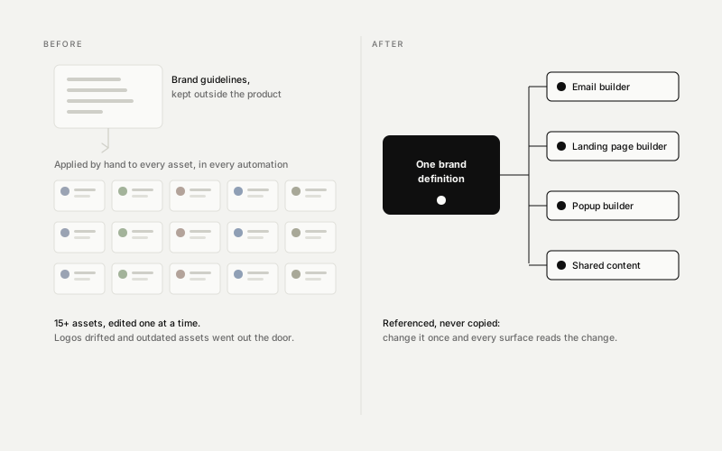
Before and after: a brand document outside the product applied by hand, versus one definition referenced by four surfaces
The reframe: this was never a settings page, it was a distribution problem. One definition, referenced everywhere, replaces a document nobody in the product could see.
03 · The diagnosis

This was never a settings page

It is a distribution problem. So I wrote down what had to stay true on every surface, whoever renders it, and those three rules are why the rest of it held.

Reference, never copy

Assets are referenced rather than embedded, so changing one definition changes it everywhere it is used. That is the whole premise.

Exactly one primary

One logo is marked primary, and that is the one that travels when content is shared into somebody else’s app.

Degrade to a placeholder

A missing asset resolves to a placeholder, never to somebody else’s brand.
One brand definitionreferenced, never copied Email builderLanding page builderPopup builderShared content → other apps Third-party vendor
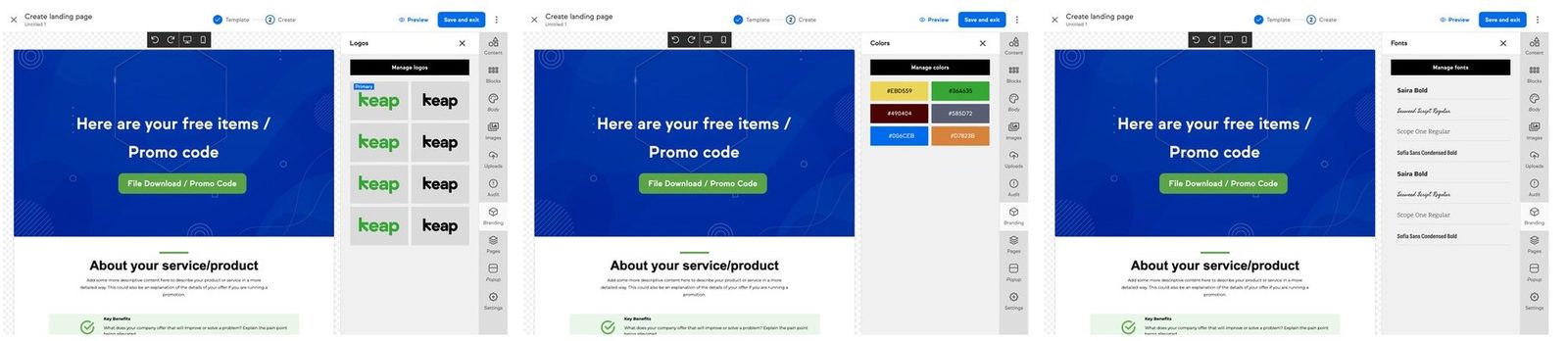
Three landing page builder screens side by side, each with a Branding panel open: logos with one badged Primary, brand colours as hex swatches, and the brand font list
The same definition surfaced where the work actually happens, rather than two navigations away in settings. Logos, colours and fonts are picked from the brand, never re-uploaded per page.

I also drew for the state the product would actually meet on day one rather than the happy path: accounts with no logo, and accounts whose existing profile logo disagreed with the new one. The second branch is the one that generates support tickets.

04 · The decision that made it scale

Keys, not IDs

Engineering proposed universal keys with a dependency-mapping table instead of raw IDs. It was the slower build, so I pushed for it. I could show that sharing scope would have to widen later, and that raw IDs would have closed that door. I won it on a design argument.
Marketing or Settings?
Testing showed people look under Marketing first, but found it in Settings without much difficulty. I chose Settings. I took the discoverability cost to get one unambiguous source of truth.
One surface or three tabs?
Splitting Branding from a Style Guide confused people about where logos, colours and typography lived. I put two competing architectures head to head in testing and took the unified one. Users could not predict the split; they could predict one place.
Custom fonts in email?
Most email clients do not render them at all. I said no, and blocked it at the control, so the honest warning never becomes a broken promise.
How many assets?
Every extra asset multiplies the surfaces that have to render it. I capped it on purpose, with a limit banner that warns before people hit the wall.
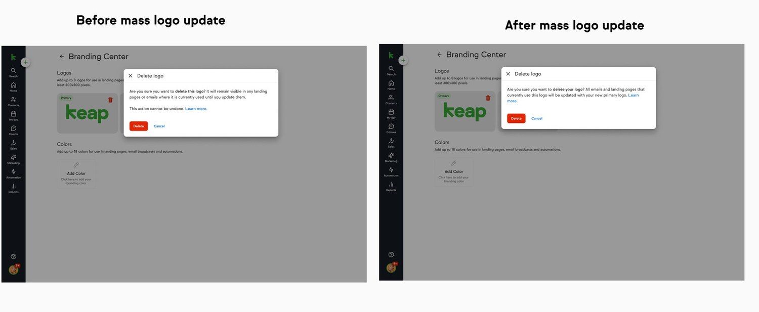
The Delete logo dialog before and after: the first warns the logo stays visible until each asset is updated, the second states every email and landing page will be updated with the new primary logo
The same dialog, before and after the reference rework. Reference-don’t-copy is what turns an honest warning into a promise: once the system can repoint every use, deleting an asset stops being a thing the user has to clean up after.
05 · Outcome

Three releases, and what usage corrected
25→15
Minutes to build a landing page, and 15→10 for an email
+20%
Landing page builder adoption after it shipped
3:1
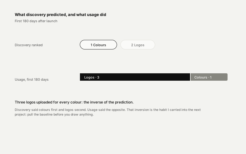
Logos to colours uploaded: the inverse of what discovery predicted
Discovery ranked colours first and logos second; usage in the first 180 days was three logos for every colour
What usage corrected. Discovery said colours first; six months of behaviour said logos, three to one. The lesson I carried forward: set the baseline before you draw.
ShippedColours and logos, reusable across emails and landing pages. I seeded every account’s existing logo in as their primary, so nobody met an empty page.
ShippedShared-content support: branded content adopts the destination app’s primary logo on install, or a placeholder if it has none.
ShippedCustom fonts, rolled out in stages with malware scanning and a quarantined font that swaps itself to the fallback.
UnfundedFurther build-out was scoped and did not get funded. What shipped is what the usage data could justify.
CancelledMass logo update: I designed it in full, and it was cancelled. Research pointed straight at it, but two of my own rules collided: reference-don’t-copy repoints rather than replaces, so a partial update could not clean up behind itself.

Adoption of the landing page builder rose 20% once brand assets became reusable inside it. The Branding Center is still in use today.
Discovery told me colours were the top priority and logos second. Six months after launch, people uploaded three logos for every colour. That inversion is the habit I carried into the next project: pull the baseline before you draw anything.What usage corrected

Let’s talk about the system you’re building